In the previous post, I created a single line graph using the tidyverse package called ggplot2 and the data set I found on Tidy Tuesday’s github repo called Maryland Bridges that explored bridge conditions in Maryland.
I will continue to use that data set in this post while getting into the next lesson of DataQuest’s Data Analyst in R track, Creating Multiple Line Graphs in R. So let’s get started!
Multiple Panels
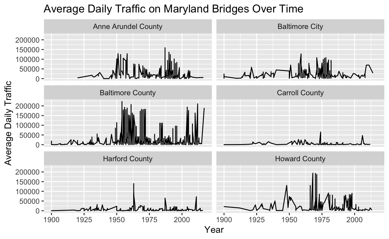
One way to improve clarity of a line graph is to plot data on different axes using multiple graph panels. I can create line graphs on multiple, adjoining panels from the same data set by adding a new layer to my graph: facet_wrap(). The facet_wrap() function splits data into subplots based on the values of a variable in my data set. I could use the ncol= or nrow= arguments to specify the number of columns or rows of panels in my visualization.
In the line graph example below, Average Daily Traffic on Maryland Bridges(Over Time), I filtered out the county variable that contained the alternate spelling of “Baltimore city” and years that were less than 1900. After creating a plot, I used facet_wrap() to further split the data into subplots based on county. I specified that I wanted two columns of panels in my data viz.
bmore_bridges_filter <- bmore_bridges %>% filter(county != "Baltimore city", yr_built >= 1900)

ggplot(data = bmore_bridges_filter) +
  aes(x = yr_built, y = avg_daily_traffic) +
  geom_line() +
  labs(title = "Average Daily Traffic on Maryland Bridges Over Time", x = "Year", y = "Average Daily Traffic") +
  facet_wrap(~county, ncol = 2)
Different Line Types and Colors
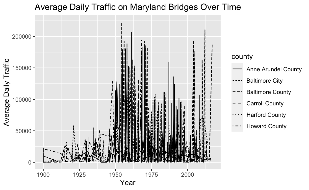
Let’s say I want to create a line graph with different values of a variable showing different styles of lines. I can plot multiple lines within the aes() layer using the lty argument. The argument lty stands for “line type” and its syntax is lty=. From the photos below, I can see that a line graph was created with different values of the county variable using different line types. Notice how this creates a legend, a box containing information about which line type matches which value of the county variable.
ggplot(data = bmore_bridges_filter) +
  aes(x = yr_built, y = avg_daily_traffic, lty=county) +
  geom_line() +
  labs(title = "Average Daily Traffic on Maryland Bridges Over Time", x = "Year", y = "Average Daily Traffic")
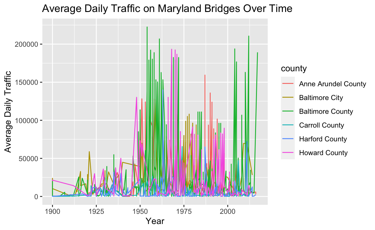
In addition to line type, I could differentiate lines for different values of a variable using color. I could use the argument color = to show different values of the county variable using different colors.
ggplot(data = bmore_bridges_filter) +
  aes(x = yr_built, y = avg_daily_traffic, color = county) +
  geom_line() +
  labs(title = "Average Daily Traffic on Maryland Bridges Over Time", x = "Year", y = "Average Daily Traffic")
Scale Limits
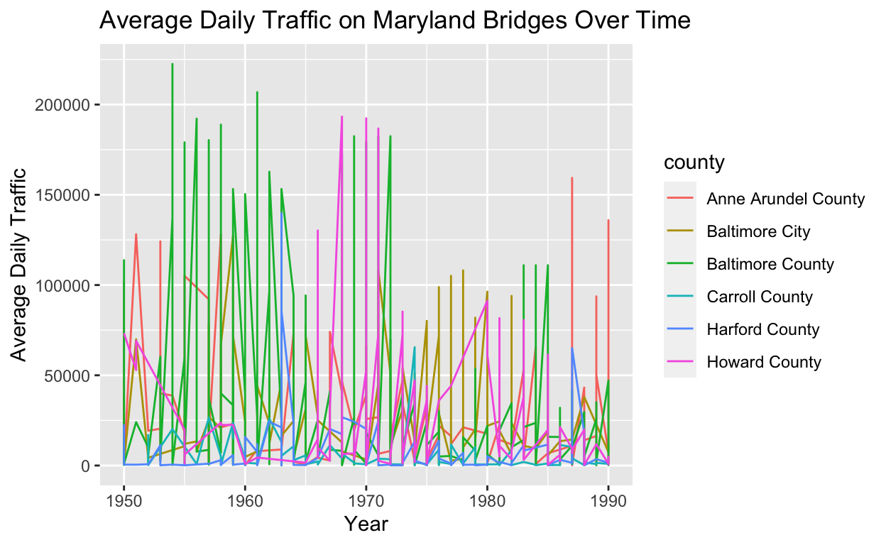
What if I want to hone in on a subset of data? Let’s say I want to hone in on bridges built between 1950-1990. This is where I would set scale limits. Scale limits refer to changing the ranges of my axes so I could only display a portion of my data. Adding the xlim() (changes x-axis) and ylim() (changes y-axis) layers to my graph allows me to display a subset of my data. In the case below, I use xlim() to change the range of my x-axis to display the years between 1950-1990.
ggplot(data = bmore_bridges_filter) +
  aes(x = yr_built, y = avg_daily_traffic, color = county) +
  geom_line() +
   xlim(1950, 1990) +
  labs(title = "Average Daily Traffic on Maryland Bridges Over Time", x = "Year", y = "Average Daily Traffic")
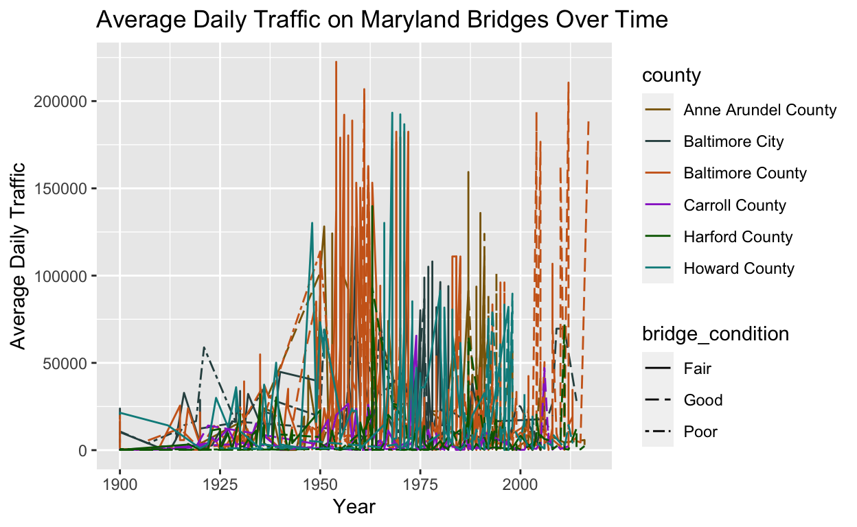
Manipulating Aesthetics
If I want to manually change the colors of my graph, I would add another layer called scale_color_manual(). The code and photo of my graph below show that I used this layer to change the colors of the values of my county variable. To manually change the line types representing bridge_condition, I would use the layer, scale_linetype_manual(). As noted in the photo below, I decided to have three line types: solid, longdash, and twodash.
ggplot(data = bmore_bridges_filter) +
  aes(x = yr_built, y = avg_daily_traffic, color = county, lty= bridge_condition) +
  geom_line() +
  scale_color_manual(values = c("darkgoldenrod4", "darkslategrey", "chocolate3", "darkorchid", "darkgreen", "darkcyan")) +
  scale_linetype_manual(values= c("solid", "longdash", "twodash"))  +
  labs(title = "Average Daily Traffic on Maryland Bridges Over Time", x = "Year", y = "Average Daily Traffic")
I want to share the resources for manipulating colors and line types in R that DataQuest shared in this portion of the lesson.
Though I’m still new to this whole data visualization in R, I can honestly say that this is really fun. I’m enjoying experimenting with aesthetics and the different ways to present information in a graph. I’m going to keep practicing and experimenting with aesthetics and learning about different plots. Until next time…