In the last two posts (Creating Line Graphs and Creating Multiple Line Graphs), I went over creating line charts. To refresh your memory, a line chart is a type of plot used to visualize changes over time. In this post, I’ll go over three more plots that were part of the data visualization mission of DataQuest’s Data Analyst in R track: bar charts, histograms, and box plots.
For this post, I decided to continue with the Maryland Bridges data set I used in previous posts.
So without further ado, let’s get started!
Bar Charts
Bar charts represent grouped data summaries using bars with heights proportional to values of a summary variable such as average. Like line charts, bar charts depict the relationship between two variables. These charts have an x and y axes; The x-axis represents the independent variable while the y-axis represents the dependent variable.
To create a bar chart, I would need the same syntax for the data and aesthetics layers that I used to create line charts. However, this time I need the geom_bar() layer as this layer creates the bar chart.
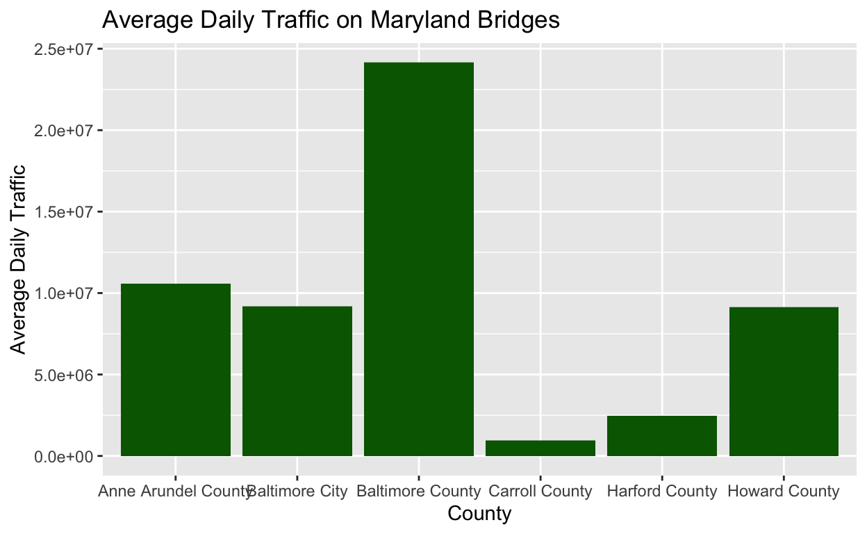
Let’s look at an example. I want to create a bar chart that shows the average daily traffic of Maryland bridges by county. As I did in my line chart post, I filtered the data, then added my ggplot() and aes() layers. I add my labs() layer as the last layer.
After the aes layer, you’ll see the geom_bar() layer, which has two arguments: fill, which represents the color of the bars and stat = “identity”. Using stat = “identity” overrides the default behavior of the height of the bars corresponding to the number of values, and instead creates bars equal to the value of the y-variable.
bmore_bridges_filter <- bmore_bridges %>%
  filter (county != "Baltimore city", yr_built >= 1900)

ggplot(data = bmore_bridges_filter) +
  aes(x = county, y = avg_daily_traffic) +
  geom_bar(stat = "identity", fill = "darkgreen") +
  labs(title = "Average Daily Traffic on Maryland Bridges", x = "County", y = "Average Daily Traffic")
Histograms
Unlike a bar chart or a line graph, a histogram is used to understand characteristics of one variable. Histograms depict the distribution of the variable, in other words the frequency with which values of a variable occur.
To create the histogram, I would use the layer geom_histogram(). I can specify two different arguments in the geom_histogram() layer to specify the number of categories for binning the independent variable.
- binwidth = specifies the size of the bins. This is useful for when I want categories to span specific intervals.
- bins = specifies the number of bins. This is useful for experimenting with how much detail I want to use to display my data.
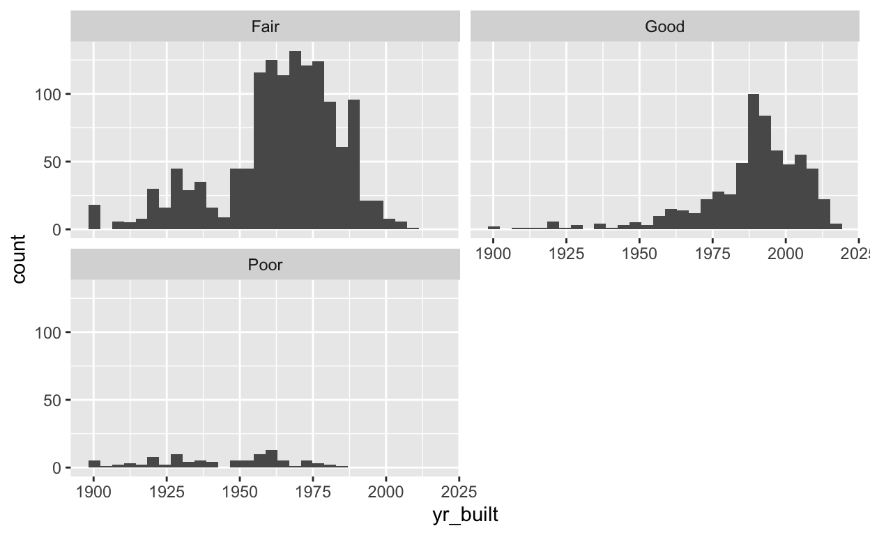
The code below is to create a histogram that shows the year the bridges were built and the condition they’re in. After establishing the data and aesthetics layers, I used geom()histogram to create the histogram and I specified the number of bins I want in my histogram. As I did in my line graphs post, I used facet_wrap() to further split the data into subplots based on bridge condition.
The histogram below is showing the distribution of all the values of the yr_built variable of my bmore_bridges_filter data frame. On the x-axis is yr_built variable, which represents the year the bridges were built. On the y-axis is a variable that is automatically created when you create a histogram. The count variable represents the number of values of the yr_built variable that fall into each of the categories on the x-axis.
ggplot(data = bmore_bridges_filter) +
  aes(x = yr_built) +
  geom_histogram(bins = 30) +
  facet_wrap(~bridge_condition, nrow=2)
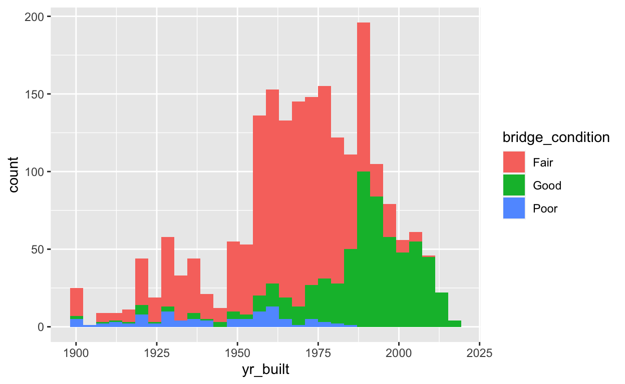
As I did with line graphs, I can use color to distinguish between variables within the aes() layer. In the example below, I used the fill= argument, which depicts bars filled in with different colors.
ggplot(data = bmore_bridges_filter) +
  aes(x = yr_built, fill = bridge_condition) +
  geom_histogram(bins = 30)
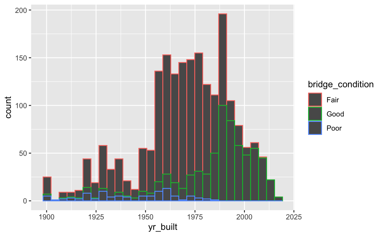
Alternatively, I could use the color= argument which maps my specified variable to bar outlines of different colors. Check out the example below and note the difference between color and fill.
ggplot(data = bmore_bridges_filter) +
  aes(x = yr_built, color = bridge_condition) +
  geom_histogram(bins = 30)
Box Plots
Box plots provide a summary of data for each group and provide information about how the data is spread. I would add the geom_boxplot() layer to create a box plot. Box plots present data in what is known as the five-number summary. The five numbers refer to percentiles of the data I’m working with. The five percentiles summarized by a box plot are the following:
- The largest value: Represented by the top of the black line extending from the top of the box. These are also known as “whiskers”.
- The third quartile(Q3): Represented by the top of the box. Seventy-five percent of the values are smaller than the third quartile.
- The median: Represented by a thick black line. The median is the value that falls int he middle of the data.
- The first quartile(Q1): Represented by the bottom of the box. Twenty-five percent of the values are smaller than the first quartile.
- The smallest value: Represented by the bottom of the black line extending from the bottom of the box.
The example below shows the code used to create a box plot. With the exception of the geom_boxplot() layer, it’s pretty much the same thing I’ve done with plots I previously went over.
ggplot(data = bmore_bridges_filter) +
  aes(x = bridge_condition, y = yr_built) +
  geom_boxplot() +
  theme(panel.background = element_rect(fill = "white")) +
  labs(title = "Conditions of Maryland Bridges Over Time", x = "Bridge Condition", y = "Year")
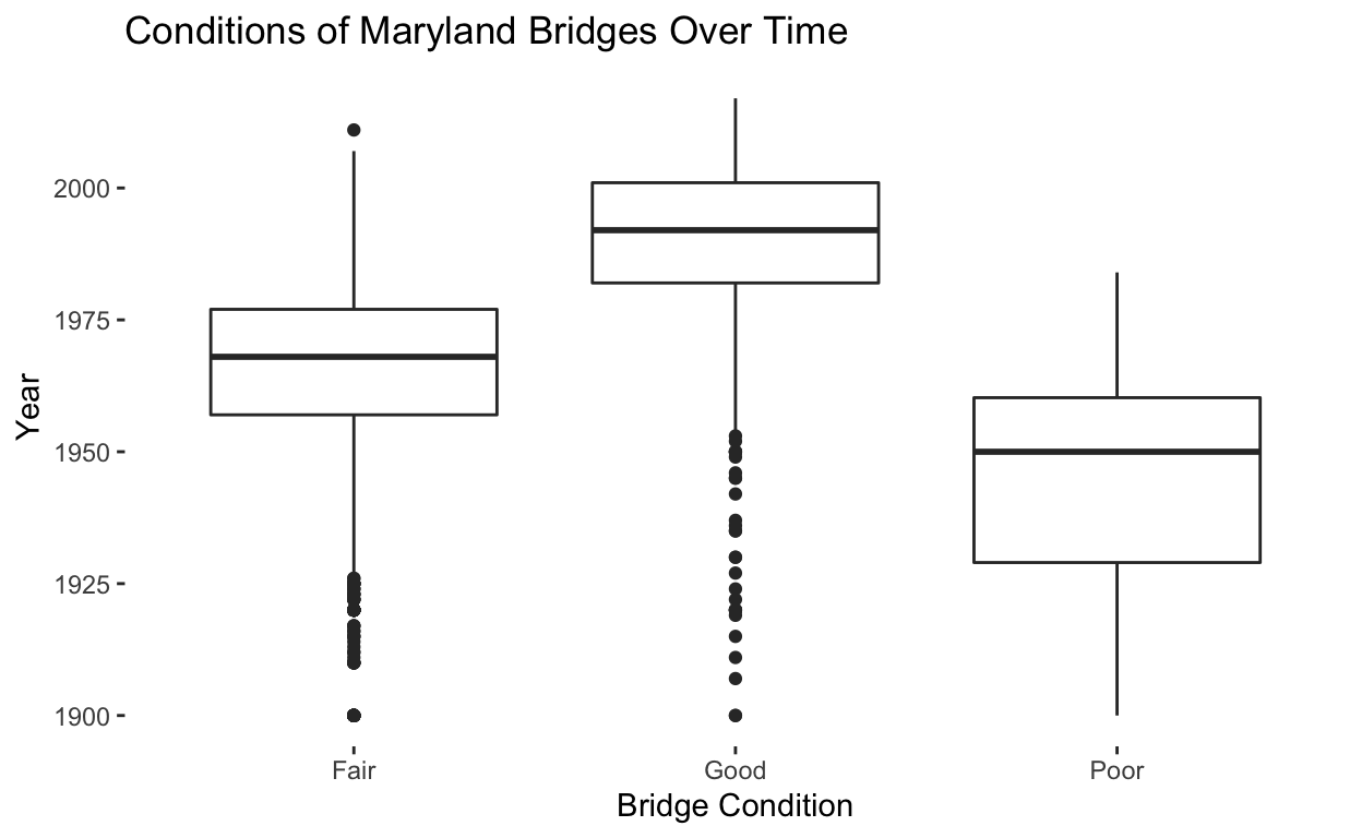
When creating a box plot, you’ll sometimes notice some points that fall below the bottom of the black lines that represent the smallest value. These points are known as outliers because they are outside the range of would be expected based on the rest of the data.
I am really enjoying learning experimenting and visualizing using different types of plots. Looks like I’m going to have to brush up on statistics to gain a deeper understanding of how this all works.
I can’t wait until I am able to do this in a work environment. Well that’s all for this section! Until next time…